


For the first time in a decade, Instagram has a new text logo

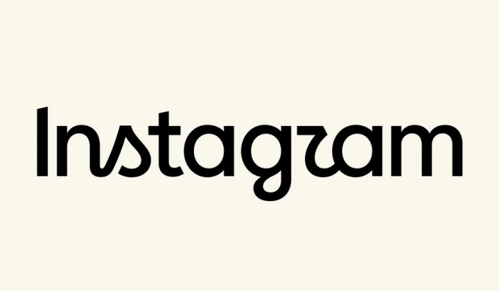
Instagram rolls out a redesigned wordmark
According to НВ — Техно: Published: August 13, 10:20 PM
Platform chief Adam Mosseri unveiled the updated typography in posts on both Instagram and Threads. The old lettering had been in use for ten years and, by the company's own admission, felt dated. The new font introduces decorative strokes in the letters s, r, and g, giving the wordmark a sleeker, more current look.
Some English-speaking users have already shared their reactions, joking that the r makes the name appear to read “Instagzam.” The previous major redesign took place in 2016, when Instagram traded its brown camera with a rainbow stripe for a pink gradient. Mosseri described the new logo as
“clearer and more modern”
.
Meta, the company that owns Instagram, has not announced whether the platform's app icon will also change. TechCrunch was the first to report the news. The redesign arrives as social platforms increasingly compete for attention through visual polish, and it may help Instagram feel fresher to audiences accustomed to constant digital updates.
The logo change signals Instagram's broader effort to keep pace with current design trends and user tastes. A refreshed brand identity could influence how recognizable the platform feels, particularly among younger users who gravitate toward innovation. Instagram's past visual updates suggest the company remains focused on staying competitive in the crowded social media space.

Read also